Tuesday, October 30, 2012
Newspaper Ad Final File
After on-screen critique I decided to change the layout of my ad as suggested. My file contains two vector images and a bitmap.
The size of my file is 3.79 in. x 6 in. The price to run this ad in the Collegio would be $36. Here is the formula:
2 column inches X 6 inches = 12 column inches X $4 = $36
Copyright statement: Rings were created in Illustrator using symbols. The bitmap and other vector image was created by me, Erin Brisbin.
Tuesday, October 23, 2012
XBOX 360 Cake
Over the weekend, I made a groom's cake that was based on an XBOX 360. I planned to do the cake in a combination of buttercream and fondant, but after having some set backs, I ended up using all buttercream.
The game on top of the cake was made out of rice krispie treats and edible paper.
The game on top of the cake was made out of rice krispie treats and edible paper.
National Logo Redesign- eBay
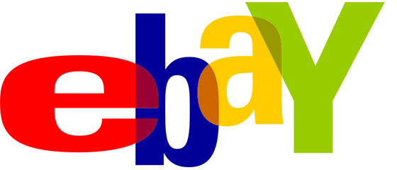
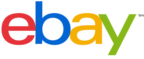
eBay recently redesigned its logo. They went from an overlapping and jumbled, non-uniform stroke sans serif text to a uniform sans serif text with the letters touching but in a straight line. The colors stayed basically the same except the red and blue are slightly different than before.
eBay's reason for the redesign was "The changes we’re making reflect the new eBay and our evolution as a marketplace that connects the world to the things they need and love." The changes they are talking about are making eBay have a better shopping experience and what they call the "New eBay." The logo change was one of the first of many changes they are making according to their website.
They implemented this new logo on their website October 10, 2012.
Personally, I like the new logo better than the old one. It seems more modern and clean. One thing I would change about it tho is I would have kept the colors the same as the old logo.
Sources: http://www.theverge.com/2012/9/13/3326716/ebay-logo-redesign
http://www.ebay.com/new
 |
| Old Logo (Source: http://www.theverge.com/2012/9/13/3326716/ebay-logo-redesign) |
 |
| New Logo (Source: http://www.theverge.com/2012/9/13/3326716/ebay-logo-redesign) |
eBay's reason for the redesign was "The changes we’re making reflect the new eBay and our evolution as a marketplace that connects the world to the things they need and love." The changes they are talking about are making eBay have a better shopping experience and what they call the "New eBay." The logo change was one of the first of many changes they are making according to their website.
They implemented this new logo on their website October 10, 2012.
Personally, I like the new logo better than the old one. It seems more modern and clean. One thing I would change about it tho is I would have kept the colors the same as the old logo.
Sources: http://www.theverge.com/2012/9/13/3326716/ebay-logo-redesign
http://www.ebay.com/new
Sunday, October 14, 2012
Newspaper Thumbs & Roughs
This assignment is to create an ad to go in the Collegio. Our budget is $197, it cost $4 per column inch to put an ad in the Collegio. My ad is going to be 7.71(4 column inches) inches x 3 inches. It would cost $48, here is the equation I used to get that price:
4 column inches X 3 inches = 12 column inches X $4= $48
I plan to have my ad contain a bitmap and a vector image.
My ad is for a fictional jewelry store and the audience is younger people on a budget interested in getting married. The call to action is to come to the store, buy an engagement ring, and receive 10% off on a wedding band set.
 |
| Thumbnails |
 |
| Rough (7.71x 3) |
Tuesday, October 9, 2012
Direct Mail Final File
My final file includes two four-color (CMYK) flattened photoshop files that were saved as an .eps, two Illustrator files, a reverse, and a full bleed.
The Harvest House leaf logo was created by me, Erin Brisbin, in Illustrator. Flower photo downloaded from Creative Commons and was created by likeaduck. Tomato picture was downloaded from Creative Commons and was created by torugatoru. Facebook emblem Illustrator file was downloaded from the server, Share 1, in E104.
To print my 11x17 inch color proof it cost sixty-five cents. For 500 (250 of each design) four-color, two sides, with .25 inch margins, .125 inch bleed, 7x5 inch cards, printed on coated kromekote pt. white paper it would cost $141.10 for all and $.28 per card.
 |
| Front of flower audience card |
 |
| Back of flower audience card |
 |
| Front of vegetable audience card |
 |
| Back of vegetable audience card |
Friday, October 5, 2012
Monster Cakes and Cupcakes
Today, I made two double layer 8 inch round cakes iced and decorated in buttercream frosting. First, I flat iced them in the color the 'hair' was going to be, then added the eye(s) and mouth, then used a grass tip to create the 'hair.'
These are the matching sugar cookies. They were iced with melted white roll icing and decorated with buttercream frosting.
These are the matching sugar cookies. They were iced with melted white roll icing and decorated with buttercream frosting.
Thursday, October 4, 2012
Preflight Check List Process
Preflight is checking the job that will be submitted to the printer for any problems. This saves time and prevents the job from being held up on the press.
Here is an example of a preflight checklist:
Sources: http://www.onlinedegrees.org/calculator/salary/prepress-technicians-and-workers
http://inkd.com/earn/prepress
Here is an example of a preflight checklist:
- Package your file
- Make sure there are no missing fonts
- Make sure there are no missing links to any images, photos, or vectors used
- Delete unused color swatches
- Process colors should be CMYK
- Remove spot colors, or if spot colors are necessary for your job make sure they are applied properly
- Delete all unused elements
- Make sure all layers are correct
- Create a PDF of what your file should look like
- Know what kind of files your printer accepts and make sure to submit the correct file type
Sources: http://www.onlinedegrees.org/calculator/salary/prepress-technicians-and-workers
http://inkd.com/earn/prepress
Tuesday, October 2, 2012
Copyright Basics for Designers
Copyright parameters are important to designers because when using someone else's work they need to know how they can use it and if they can even use. Also, copyright is important to protect a designer's own work from infringement.
Copyright can apply to images, content, intellectual property, and fonts. If you created it, it is considered copyrighted by you. Your permission is needed for others to use. If you post something online you can specify whether or not others can use it. You can delegate that it has some rights reserved and that they must attribute the it to you.
Fair use means that in some situations others can use your work without permission. Examples of these situations are educational purposes and using them in an article critiquing your work.
Everything you find online is not copyright free.
Sources: http://www.smashingmagazine.com/2011/06/14/understanding-copyright-and-licenses/
Image downloaded from creative commons on October 2, 2012 created by PhotoMasterGreg http://www.flickr.com/photos/photomastergreg/3831379129/sizes/l/
Subscribe to:
Posts (Atom)


